Beginning this slideshow presentation was fairly difficult. Coming up with a main idea was the most crucial aspect of this assignment, and overall I think I did an okay job, but once I saw my final product I was disappointed in how mundane it seemed. One thing that I would definitely change would be the music, I feel like having just the piano music without the lyrics would be a better alternative. It was also recommended in the class critique that I sequence the photos of doors in a more organized fashion. I was unsure of how I wanted to order them, and I went with small categories, like grouping fairly plain doors together then getting progressively more interesting and cluttered. The audience, however, would probably be more in tune if the doors went by composition, from doors to the left of the picture plain, to those in the middle, to those on the right. Placing the doors on the same horizon line would also be beneficial.
I do like this typology of the front doors, and how they reflect the personality of the house and its owners, but I feel that it would work better if it were presented differently. Slideshows are cool and all, but seeing door after door after door could make them lose their charm...as they ended up doing. I would prefer presenting them all at once, like the groups of photos below by Jeff Brouws and Julia Baum. A grid would still present the idea of unity and uniqueness, without the three minutes of doors, doors, doors. This may show up in a future website, who knows.
Monday, November 29, 2010
Wednesday, November 10, 2010
Slideshow
I had some difficulty deciding on how to approach this project, only because of the idea of unity. Having all of the pictures stand on their own - yet work together - seemed kind of a backwards approach to me. Typologies really interested me when my professor showed examples of a few photographers who were inspired by similar ideas, objects, places, and so on.
Objective:
Driving down the road to my apartment, it hit me. I've always had a fascination with the houses down this road because they have various colors, knick knacks, and furniture that really add to the character of the house and even the people who live there. My objective for this slideshow is to shoot front doors. I want to capture the personalities of my neighbors through the entrance to their homes.
Method:
An important positive to my subject is the fact that these houses are quite permanent for the time being. I can go back to each location in different lighting and conditions without worrying that something has changed drastically. I will be focusing on the houses down my street - because they are the ones I find so fascinating - but I plan on branching out to other streets parallel to mine. So far, I have shot photos of the front doors down my street, and I plan on going back to these same houses to take more detailed shots. For example, a doorknob, a wind chime, a child's toy car, all the while keeping the front door in sight.
Inspirational Photographers:
Jeff Brouws - This is one of the photographers we talked about in class. Brouws has many typologies in his portfolio, including abandoned gas stations, painted houses, and empty signs. His work inspired me to create a typology that emphasizes one idea, but portrays that idea in a way that holds interest and does not become too mundane. A typology of his that most resembles my idea is of freshly painted houses. They are very colorful, and even though the houses all have extremely similar characteristics, each holds its own identity. This is what I'm hoping to accomplish with my doors.
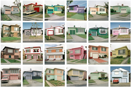
Julia Baum - As I was researching different artists' typologies, I came across Julia Baum's portfolio. She documented houses that were built in the 1950's from the same foundation, but over the past fifty years, these houses have undergone huge changes according to the owners. They went from being from the same stencil to having their own identities. I thought this fit well with my project on front doors, not only from the architectural point-of-view but because of the way personality snuck its way into homes.

Sunday, November 7, 2010
William Klein and Elliott Erwitt
Researching these photographers' work before writing this blog was very interesting to say the least. Both of them work primarily in black and white, and the situations they depict are definitely narratives in that when a viewer looks at one of their photos, they want to know more. There is an air of mystery to both Klein and Erwitt's work. Who are these people, and what is their story? Klein takes a very funky and fashionable approach to these stories whereas Erwitt takes a very personable approach with more average subjects.
I really appreciate William Klein's work in that it may not show the best technical qualities - a lot of his photos are overexposed and blurred - but it is exceedingly interesting. Almost every photo is a portrait and many of these portraits seem to be candid. Klein's work is strongly based on design, with huge contrast and great composition, using either the rule of thirds or having the focal point in the very middle of the photo and it working anyway. He has a very good sense of foreground, middle ground, and background.
Take the picture below for example, the use of line, contrast, and staccato rhythm not only makes viewers stare in wonder, but it also holds interest as they ask themselves who these women are...and why they are dressed this way.

Elliott Erwitt's work is different from Klein's because his photos have a more comical approach, with somewhat satirical references to everyday life. His photos are easy to relate to for viewers, while still retaining the narrative aspect. Below lies one of his illusions:

I really appreciate William Klein's work in that it may not show the best technical qualities - a lot of his photos are overexposed and blurred - but it is exceedingly interesting. Almost every photo is a portrait and many of these portraits seem to be candid. Klein's work is strongly based on design, with huge contrast and great composition, using either the rule of thirds or having the focal point in the very middle of the photo and it working anyway. He has a very good sense of foreground, middle ground, and background.
Take the picture below for example, the use of line, contrast, and staccato rhythm not only makes viewers stare in wonder, but it also holds interest as they ask themselves who these women are...and why they are dressed this way.
Elliott Erwitt's work is different from Klein's because his photos have a more comical approach, with somewhat satirical references to everyday life. His photos are easy to relate to for viewers, while still retaining the narrative aspect. Below lies one of his illusions:
Subscribe to:
Comments (Atom)